
Here are six cover concepts for my novel, The Tears of Boabdil, published this September. Can you help me choose which concept to go with? The execution is far from perfect (I’m a writer, not a graphic designer), so please comment on the concept. A real designer will execute it.


The cover needs to be arresting and to signal:
- Deception
- Muslim
- Police
Which version should I use?

Hello Neil I like no 2 because the red background is very striking and I like the evil eyes. I also like the half faces not sure which one ……maybe no 6 as it makes him an ordinary cooper when we know he isn’t. Not sure if I’ve helped…..Von x
LikeLiked by 1 person
Thanks, Yvonne. That helps enormously
LikeLike
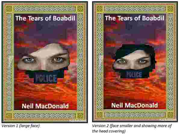
No. 1 the larger picture of the female face.
Jilly
Jilly Funnell [cid:image003.png@01D634E6.A8FA0B90] https://sugaronthebee.wordpress.com/ Sent from Mail for Windows 10
________________________________
LikeLike
And I wouldn’t have the word “Police” visible – I would suggest a more subtle image that suggest the police. Hope this helps.
LikeLike
i like no.3 It implies a problem. The cloudy sky dds to that.
I also like 5 with an ordinary face. The split one you used before had the ordinary face but with a bobby. The flat hat is more eye catching. I had to look twice to see what it was in the other one.
Definitely get rid of the weird moustache it ads nothing and it was only Toni’s reference to Guyfox that made the penny drop.. Its too obscure and takes away from the serious nature of the books content.
LikeLiked by 1 person
Thanks, Mary
LikeLike
Hi Neil,
Here is my tuppence-worth based on my observation on the covers.
I wish I knew more about the story – “The Tears of Boabdil” – but that would mean a different set of observations.
I will base my comments on first impressions of walking into a bookshop.
Where would I find this book- which genre section? This is not clear to me looking at the covers.
The frame, on first glance, seems old fashion and indicates a story of literature written in the fifties or earlier.
Covers 5 & 6 are just confusing – using the Mask Anonymous and police helmets and split face is too much to grasp at a glance. Almost indicating to me an amount of farce.
Covers 3 & 4 seem rather clinical – is this about the police undercover? I don’t feel a sense of intrigue.
Covers 1 & 2 I get a vision showing angry defiance from the picture, but not any idea of the genre – what will I be reading? (of course the back cover will say more).
I agree with an earlier comment that the word police is misplaced in the sense it confuses the title. On first glance: is Police the title of the book?
A clear title – and author name with perhaps one short strap line seems to be the fashionable convention at the moment – your publisher should know.
Try to feed in the elements of; Police, Muslim and Deception onto the cover is in my opinion difficult. All you have is an image and having too many parts creates distraction.
I am sure if your graphic expert is familiar with both book covers and marketing techniques that is genre placement, he/she will find the right presentation for you.
Good luck with your book and enjoy the journey.
When is the planed publication date? Keeps us posted.
LikeLiked by 1 person
Thanks so much, James, for that very detailed commentary
LikeLiked by 1 person